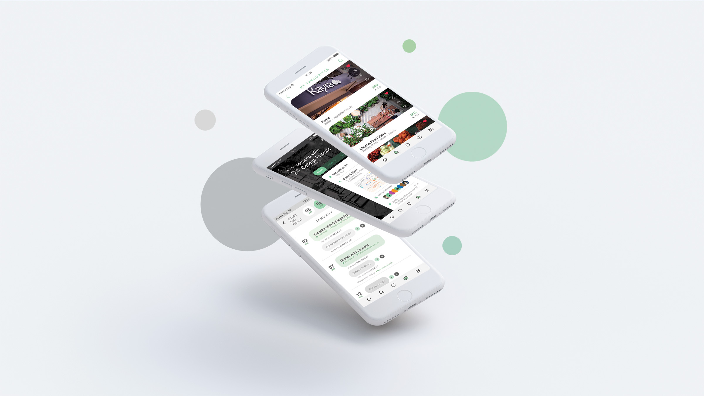
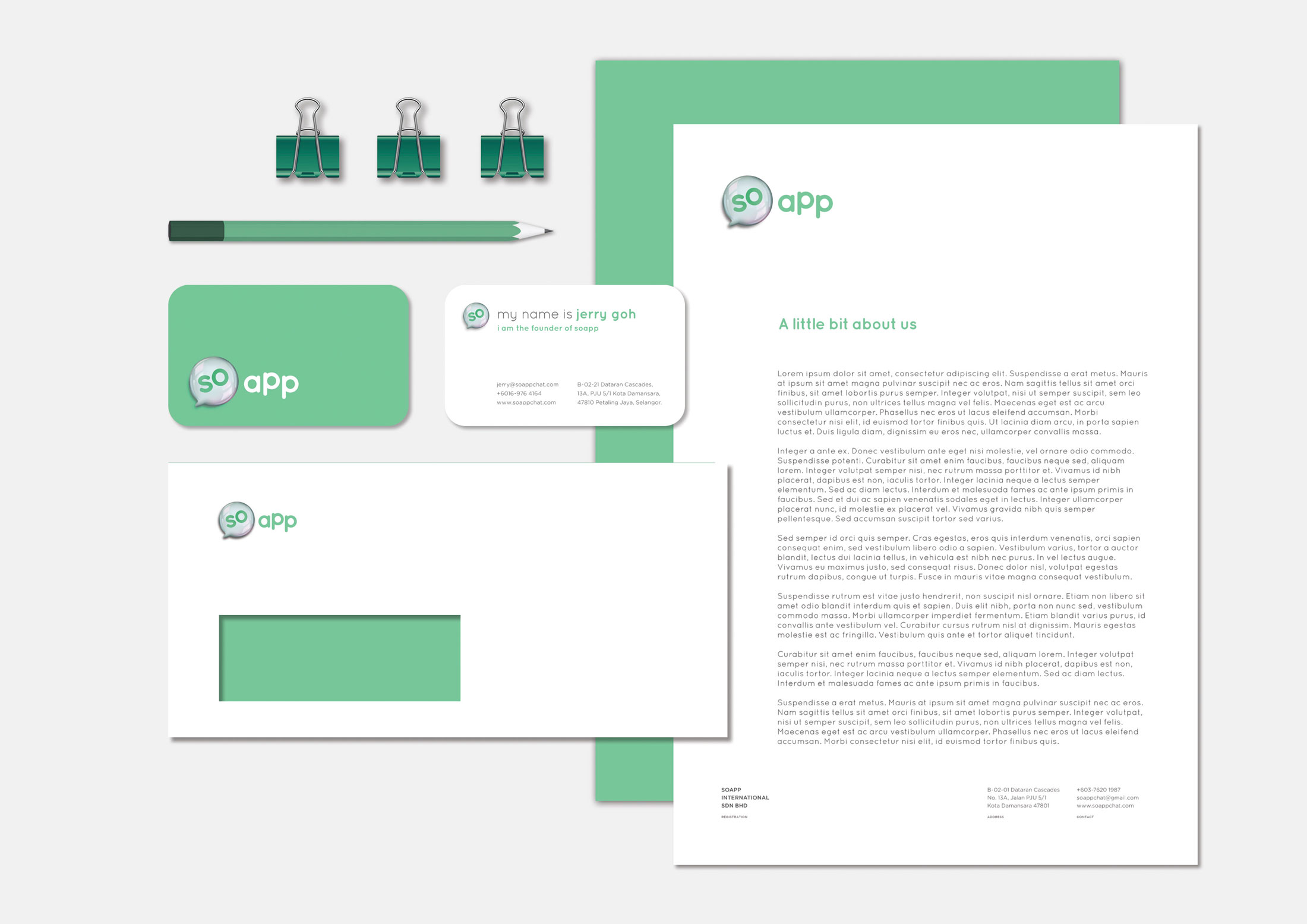
Soapp is a chat application that incorporates chat, food & beverages suggestions with an appointment scheduler. Soapp’s goal is to make scheduling appointments easier and to make face-to-face time more frequent with friends and family. We were asked to give their brand a face lift and to redesign their app’s user experience and interface.
We did competitor analysis among other chat and schedular apps and brainstormed the branding direction that would set the app apart.
I worked on the brand deck once the logo and stationery set has been finalised by my teammate. After that we started work on the chat app. We analysed the existing flow and improved upon that.
Tech savvy bunch that will always be on trend and the acceptance on new experience.
This are the working bunch that has a hectic lifestyle, Soapp will help them to catch up with their friends and family / co-workers on the scheduler, keeping their lives organised.
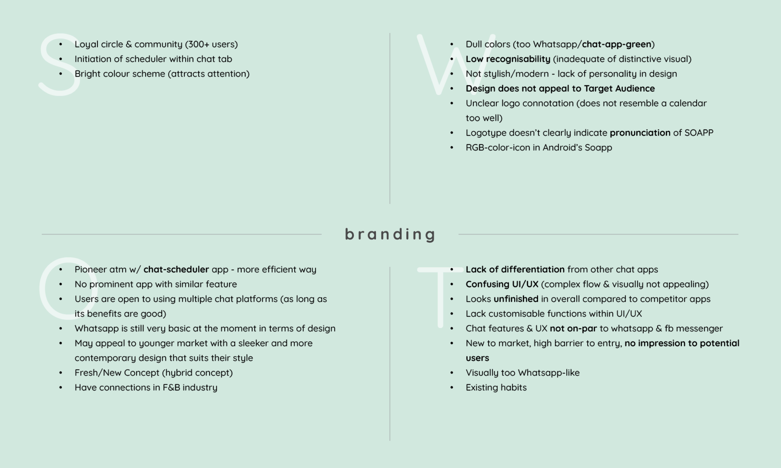
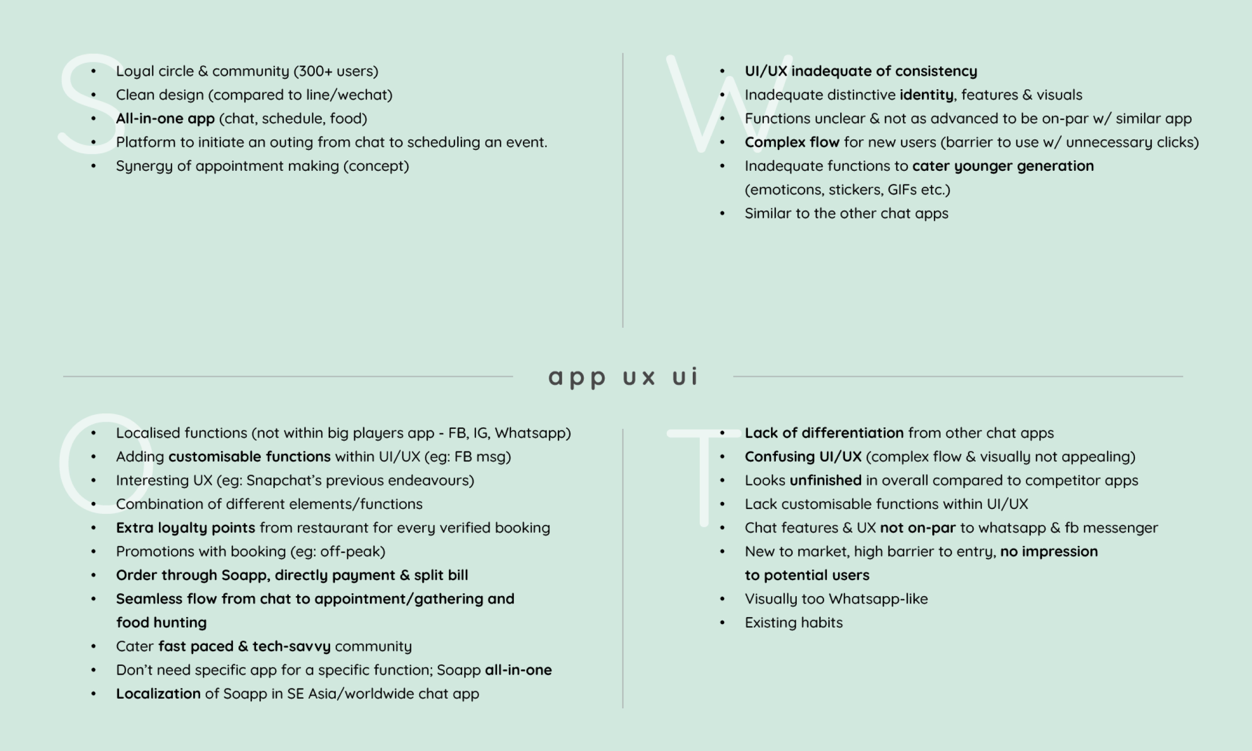
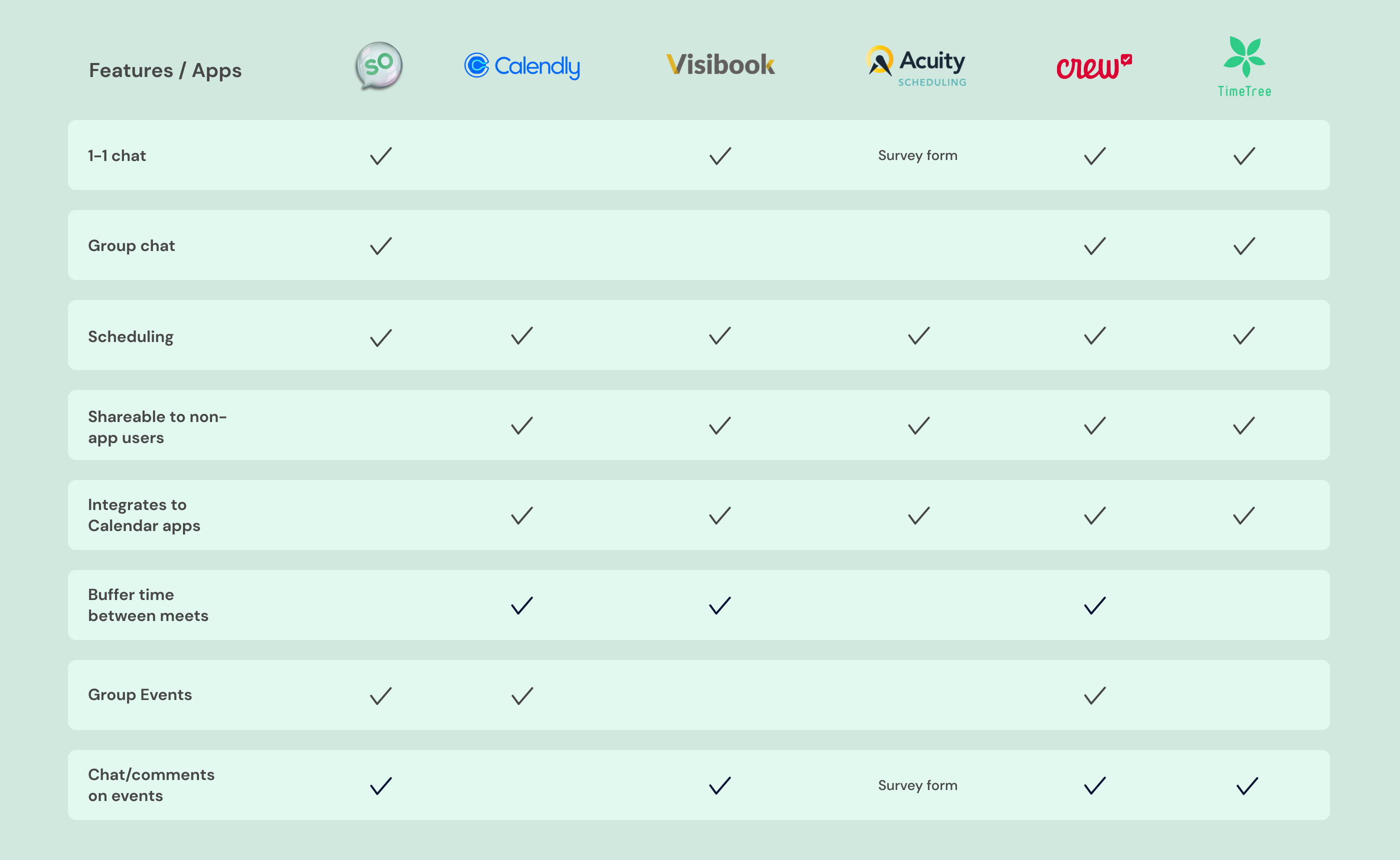
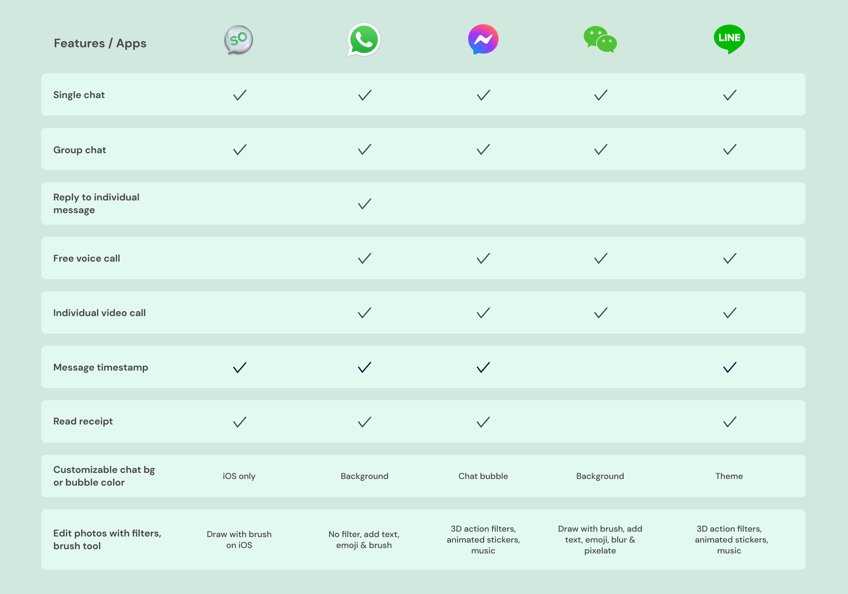
We did SWOT analysis on the existing branding and UX UI, along with competitor analysis of features between Soapp with other scheduling, chat and social media apps. After our analysis, we introduced features that we thought would be beneficial to have in Soapp.
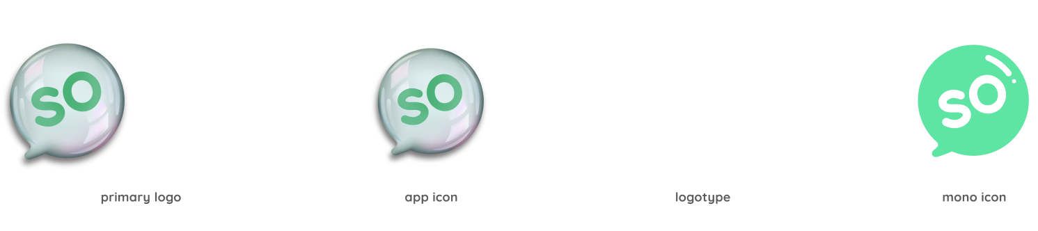
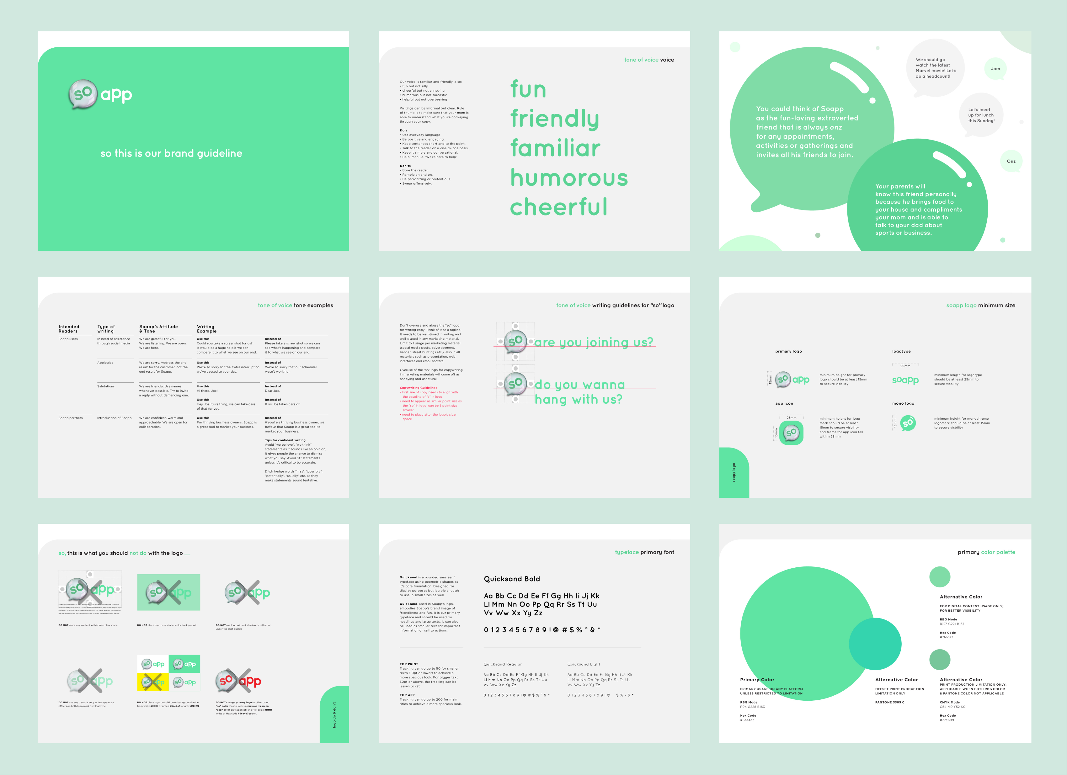
After our analysis, we started developing the identity that would be more appealing to their target audience and created a brand deck that would help keep the branding tone consistent throughout their marketing collateral.
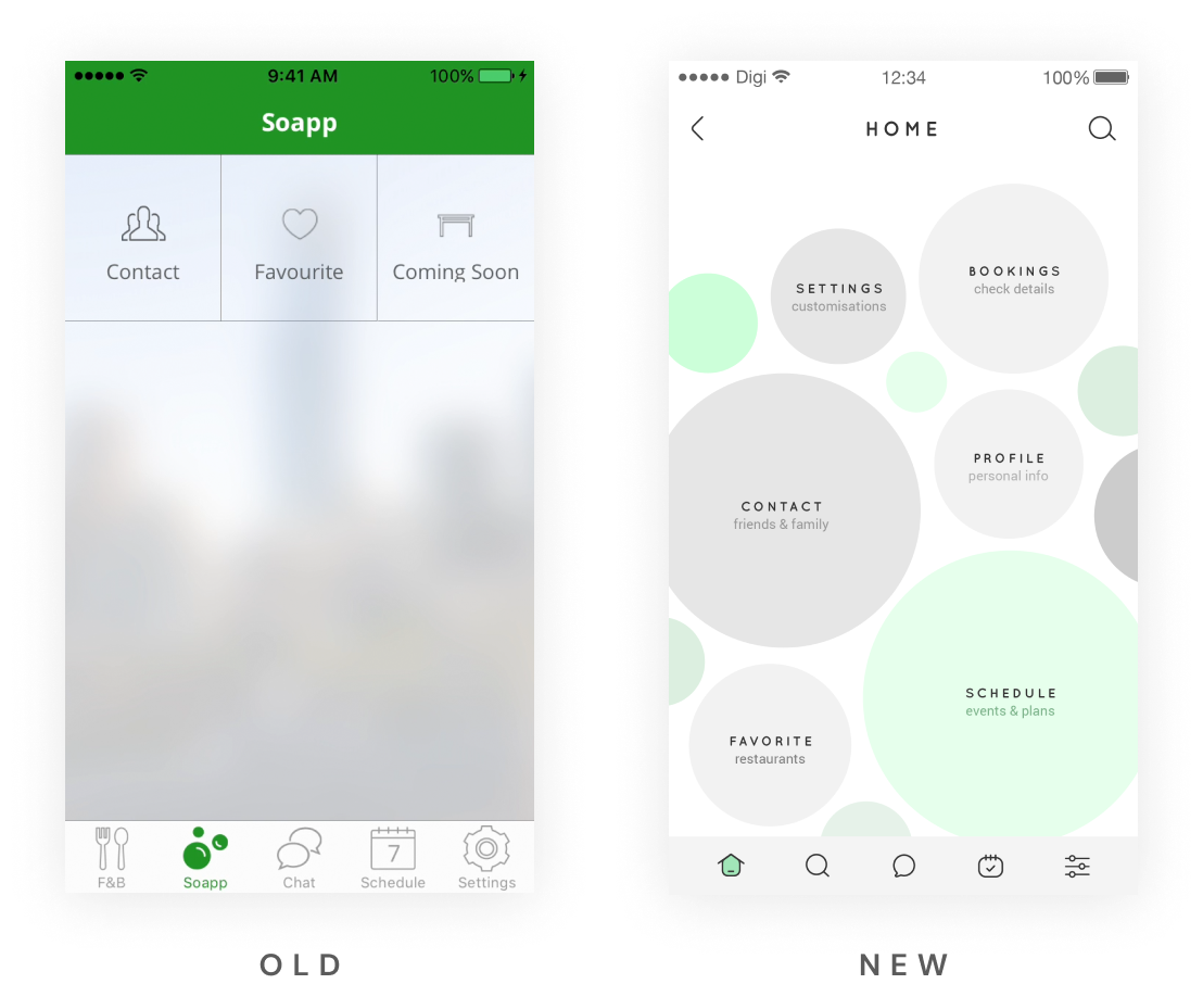
The naming of this tab was causing confusion as it’s supposed to be their home tab so we changed the icon so that it’s easier to understand, we also moved it to the far left as that’s the universal position for a home tab in majority of the apps
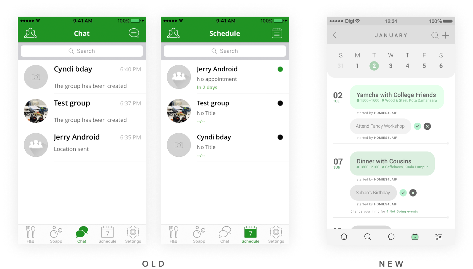
The existing chat & schedule screen were similar and hard to distinguish at first glance. We decided it would be good to have a calendar Ui to see all the appointments according to date instead of a listing with a descending order of most recent appointments.
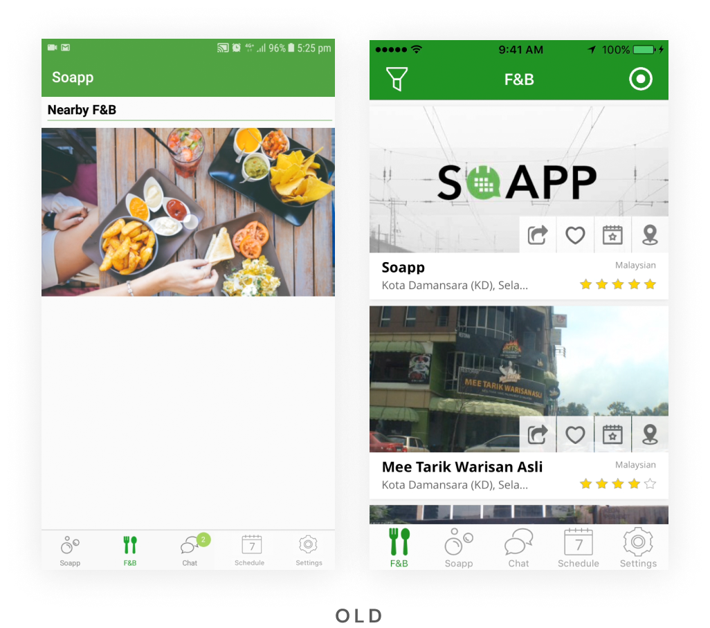
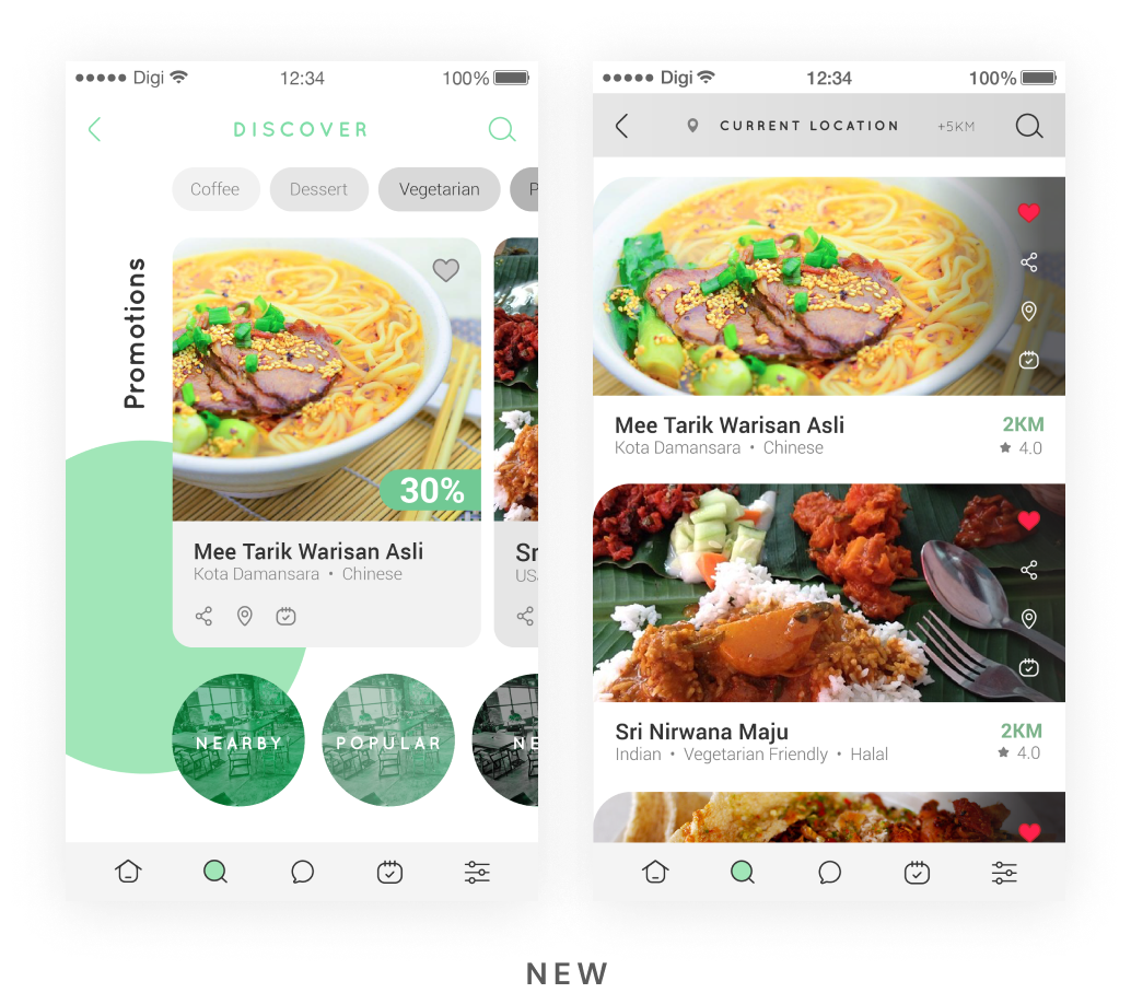
In the F&B tab, the first screen users will see is a button that leads to a listing of nearby restaurant. We thought it would be better utilised if we added more categories such as Popular & New, along with featured restaurants with promotions.
For the restaurant listing, we updated the Ui of the filter selection and all the CTA buttons that can be performed for each restaurant. We’ve shorten
the rating to create more space for the restaurants’ labels.
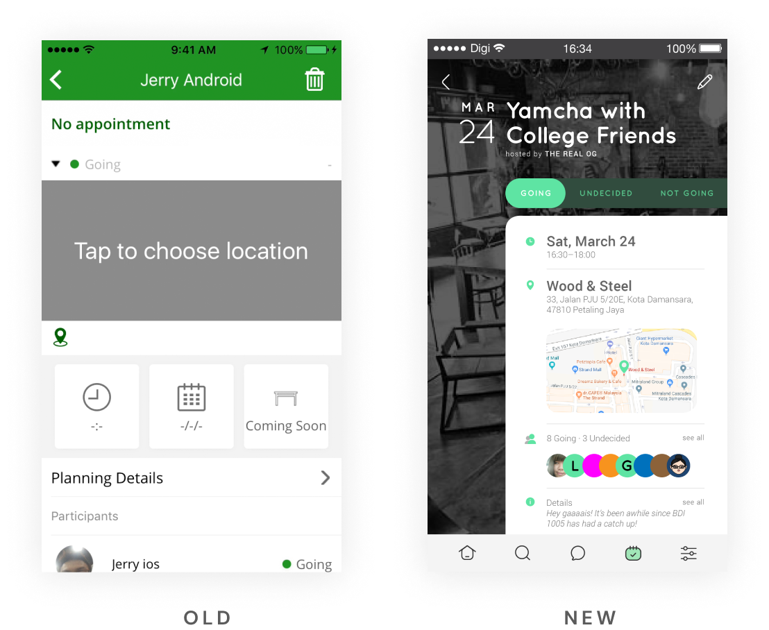
We wanted users to be able to see all the event details in the appointment screen in one glance. We decided to compressed the participants listing view which could become really long. Instead of keeping the dropdown for the 3 constant options for attendees, we decided to display all 3 choices for easier selection.
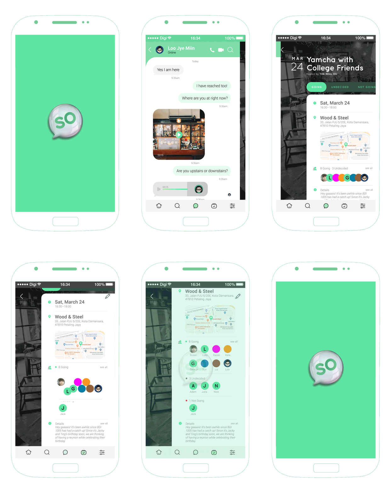
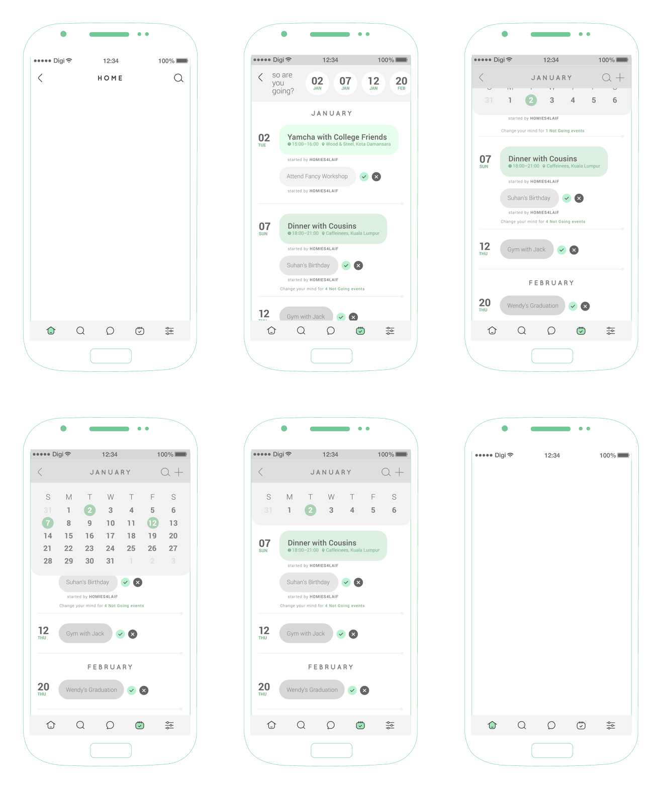
It’s the first mobile app project we ever did and coming from a visual graphics background, we proposed many interesting Ui interactions that were not practical based off from dribbble shots. We’re still very glad that the developers were open to the majority our proposed screens and gave us the opportunity to work on this project even though it’s not our forte.
This project served as the gateway into Ux/Ui for me, I enjoyed the whole process from speaking with the stakeholders, figuring out the main problems, researching existing apps, diagnosting the current flows to deciding the final color code that would be suitable for different mobile devices. In the midst of the project I realized Ui/Ux would be a good direction for me to venture in as it blended my interest in animation, systems and the practical use of design.